Robin Winslow
on 20 July 2020
The web team here at Canonical run two week iterations. Here are some of the highlights of our completed work from this iteration.
Meet the team

I am from a small island of Colombia in the Caribbean although I grew up in Barcelona, where I went to University to study Industrial Design Engineering. After my studies I lived briefly in Germany with the intention of learning the language, but 7 months after I got into a master’s program at Central Saint Martins and moved to London. I have now been in London for 4 years
Besides design I am really into politics and sociology, and spend a lot of my spare time listening to podcasts. My favourite podcasts are Radiolab and Talking Politics, and I get my morning news from Today, Explained from Vox and Today in Focus from The Guardian.
Web squad
Our Web Squad develops and maintains most of Canonical’s promotional sites like ubuntu.com, canonical.com and more.
Canonical partner programmes
This iteration we unveiled a new on canonical.com detailing our partners programmes, and redirected the old partners homepage to canonical.com/partners.

We also took the opportunity to move the rest of partners.ubuntu.com (which is now just an API) to our charmed Kubernetes infrastructure and decommission the old infrastructure. We now have only 1 site remaining on the old infrastructure – assets.ubuntu.com – which we hope to also move to in the coming months.
Newsletter signup form on cn.ubuntu.com
We added a newsletter signup form to the cn.ubuntu.com/blog section, to mirror the equivalent pages on ubuntu.com/blog.

Brand
The Brand team develops our design strategy and creates the look and feel for the company across many touch-points, from web, documents, exhibitions, logos and video.
Brandstore demo
We drew up our initial ideas into finished illustrations, completing all 10 in this iteration. We will animate them in the next iteration when the video goes into actual production.

Automotive illustrations and page updates
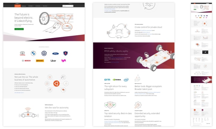
We created some new illustrations and updated a few others, whilst helping the Web Team with the design of the automotive page.


Marketing videos
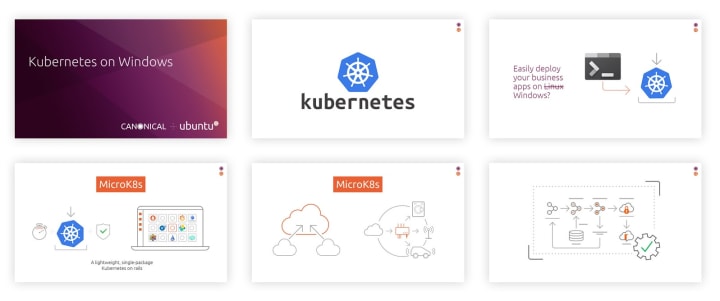
We completed 2 videos for the Marketing Team in this iteration. We worked in collaboration with the PM’s to create the 2 animated videos for a Microsoft event we are attending. The videos included VO’s and some bespoke illustrations that we animated to create some real engagement.


Vanilla
The Vanilla squad designs and maintains the design system and Vanilla framework library. They ensure a consistent style throughout web assets.
Application layout – panels
This iteration we focused on panels within the new Vanilla Application Layout. We looked at behaviour, internal structure, adjusting to the needs of the content, positioning with respect to the elements that invoke the panel UI, attachment to one or more edges of the window and how this behaviour changes with increasing / decreasing screen size.


Application layout prototype
As we are working on design of application layouts and panels we started building a prototype implementation of the layout and its responsive behaviours. This allowed us to explore different ways of implementing desired positioning with CSS (fixed positioning, CSS Grid, etc) and verify the design assumptions. We also prototyped some more advanced interactions like resizing or aligning the panels to make sure our layout will be able to support them.

MAAS
The MAAS squad develops the UI for the MAAS project.
In-app new release notification
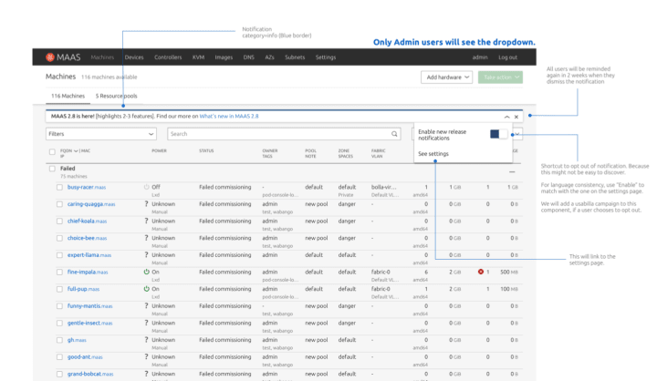
With the limitation of snap and the automatic upgrade, we want to expand our announcement channels to MAAS UI (in-app) so our users are aware of the bug fixes, security fixes, and new features in the most recent release. The up-coming version of MAAS UI will provide this announcement in app and admin users may opt out of this notification. Changes in notification settings will apply for all users in the team.
Sneak peek on our UX/UI designs:

The upcoming version will be the most simple implementation of our new release announcement in the UI. We are looking forward to growing our notification settings into something more robust! Feel free to leave us some feedback for what would be useful to notify.
CLI project
We’ve been thinking about how we might create a better experience for the maas CLI tool. We’ve noticed many usability issues in our CLI and we are looking forward to making maas more user friendly.
If you would like to participate in an interview/user testing session about the maas CLI tool with us please fill out this form.
JAAS
The JAAS squad develops the UI for the JAAS store and Juju dashboard projects.
Roadmap sprint
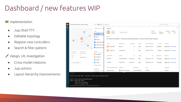
During the roadmap sprint the team had several useful cross-team sessions with Juju core and JAAS teams. We discussed and planned the work to enhance the Dashboard, its functionality and user experience.

Building the search and filter pattern
The team is building the ‘Search and Filter’ pattern on the Dashboard, in order to provide to the users the possibility of complex search queries. You can read more about this on Discourse.

Cross-model relations investigation
The team started working on the definition of the Cross-model relation functionality for the Dashboard. We interviewed Juju users to understand the ideal user-flow and amount of information to surface in the interface. Once this analysis phase is complete the team is going to start exploring the UI and overall experience.

Snapcraft and Charmhub
The Snapcraft team works closely with the Store team to develop and maintain the Snap Store site and the upcoming Charmhub site.
Charmhub
Documentation & tutorials
We implemented the default documentation and tutorials templates we use on other websites. The data is pulled from discourse to help communities easily create and contribute. Read more about documentation and tutorials.
Login
We have finished the implementation for the authentication system. Publishers will be able to login through Candid, where they will have the possibility to log in with their Ubuntu One accounts.

Developer experience
We started looking into how the new Charm Hub website support better developers throughout their journey of publishing and maintaining their charms. We initiated this process by doing a benchmarking of what other solutions of similar pages are on websites like Python, Go, ROS and Swift. Further to that, we will be doing some user interviews in the next iteration to look into the different kinds of developers needs and their user journeys.
Team improvements
Acronyms lookup
When Canonical moved to Mattermost for internal communications towards the end of June, we migrated our IRC bot to Mattermost.
At the same time, we implemented a new slash command that translates acronyms. The source of those acronyms is a spreadsheet. This allows every person that has access to it to add their own.
Anyone in the company can use it by typing `/acronym` in Mattermost.

More about this feature in an upcoming article!
Kubernetes-based PR demos
For a while, we have had a system to automatically spin up demos for each of our pull-requests to easily QA changes to our projects.

This system was based on a pre-k8s Rancher setup in a DigitalOcean box. It wasn’t terribly reliable and was difficult to debug (this was all because of our implementation and was through no fault of the aforementioned services themselves).
We have now moved these demos to a brand new Charmed Kubernetes cluster, making use of the same configurations and tools we use for our staging and production deployments. Demos are transparently triggered using Jenkins jobs, just as our production builds are.

As well as now providing a good production-like test environment, this has made the demo experience much more reliable and easier to debug.


